Arms Around the Child
 Arms Around the Child is charity with the main purpose to provide safe loving homes for children living in adversity. There aim is to make a difference in the world of poverty and strongly advise the public to get involved and support the caring charity. The main mission of Arms Around the Child is to provide a loving home, protection, education for vulnerable children, respect for peoples spirit and soul. A lot of the children who Arms Around the Child support are extremely defenceless, often infected with The human immunodeficiency virus (HIV) and orphaned after the lose of one or both parent. The purpose of this charity is to provide these exposed children with a sense of safety and community; something which they may not of felt before or lost. Arms Around the Child also say they will 'advocate for the needs of these children so that they may grow up with love and care and can look to the future with happiness'. Which proves how truly important this charity is and the impact it can cause for young helpless individuals. The general public may not really be aware of what the charity is about and its intentions which is why Arms Around the Child will help to educate the unaware with concerning the causes and effects of distress, hardship and life as an orphan through direct engagement with the public; like events and major campaigns. This charity strongly believes that all children with support or not should have a future and they strive to do everything they can to make these children have a bright future as they believe everyone deserves some form of happiness.
 General Information about the children Arms Around the Child Support
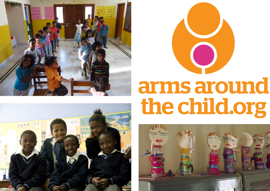 Around 142 million children have been orphaned worldwide; which is an extremely shocking and heartbreaking figure. Orphans are affected by multiple factors, some include fear, rejection, denial or basic education and health care, discrimination. Orphans suffer with depression, anxiety, neglect, emotional trauma with little or no support and this often results in exploitation and abuse. The future can be very bleak for these gorgeous children. Arms Around The Child aims to advance awareness of this horror and through Global media and campaigning we will engage the public and translate that engagement into action.
Basic Information
 The charity was founded in January 2012, and since then has changed so many peoples lives and made such a big difference to those in need. Its charity headquarters is in London with the address being 26 York Street, W1U 6PZ London, United Kingdom. Arms Around The Child works to provide a loving home, medical treatment, respect and education for children who have lost their parents or are living in adversity including sexual abuse, neglect or exploitation. The general public can donate £5 via text by messaging 'HOME58' to 70077. Americans can also donate by texting 'HOME' to 80077 to donate an immediate $10. The charities contact details are as followed; phone - 0845 094 9491, email - info@armsaroundthechild.org and if you want to see some of the charities work and find out more information the official website is - http://www.armsaroundthechild.org/.
Social Media
This is a screen grab from Arms Around the Child's official Facebook page, which allows the general public to socially connect with the charity and easily find more information rather then having to search around on the internet. It also provides a social element to the charity which is a good platform for creating a buzz and getting more people aware of the useful organisation. People who aren't aware of the charity could stumble across it through Facebook friends which again causes awareness.
This is a screen grab from Arms Around the Child's official twitter page, the account is very active and 'tweets' are constantly updated. The most recent tweet was about a music festival which was created to raise funds for the charity. The festival was called Sharper Sounds Memorial Festival which was hosted by Pixelated People as apart of a two-day music festival to celebrate the late and great Sam Harper-Brighouse.
The Other Ball
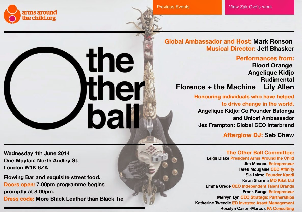 The Other Ball is an annual London event designed to raise funds to protect at risk children in India and Africa from adversity and exploitation. During this amazing evening kindred souls will come together to transcend the machine and lift the spirit to bring hope to these children. Mark Ronson, the incredibly talented Producer and Artist will host The Other Ball, bringing along some of his enlightened musical friends in a collaboration with amazing Musical Director and Super Producer Jeff Bhasker to create a magical experience on Wednesday June 4th 2014 at secret location in London. Following hot on the heels of the inaugural Other Ball in New York, which included performances by The Black Keys, ASAP Rocky, Miguel and Nate Ruess, Mikky Ekko and Lykke Li the London event will enlist the very best in entertainment. An auction of Black Leather Bears dressed by Louboutin, Alexander Wang, Thom Browne and many more provided the highlight for New Yorkers including Leonardo Di Caprio, Danger Mouse, Eve Hewson, Sean Lennon, Alek Wek, Clive Davis, Troy Carter. Sponsored by Topshop and Topman, the event was hailed as “The Event of The Year.” The event honours individuals who have helped to drive change in the world, beginning with their own community.
Millions of children in the developing world are suffering. Losing parents, being infected with HIV or other diseases, being prey to those out to harm them, being trafficked or sold, or being sexually abused – all of these issues are real for millions of kids in our world and its unacceptable for us to sit by while innocent children are harmed Arms Around the Child wants to provide safe loving homes to as many of these children as possible whilst advocating for a kinder world. And we need your help. Our collective energy changes everything.
2013 The Other Ball
This video is from the 2013 The Other Ball which highlights some of the events best moments. It also has famous people discussing the charity and how effective it is with the helping of children in need.
Official Website
Arms Around The Child News
- Angel Haze is now a Global Ambassador for Arms Around the Child which is a development for the charity as the the famous musician will obviously really help the organisation but also create more publicity and popularity within young people.
Quotes from Arms Around The Child
- £20 a month helps provide life saving medicine for a child
- 3.5m children are infected with the HIV virus
- 151m children are living homeless on the streets
- 1.2m children are trafficked every year
- 600m children are living in absolute poverty
- 40m children are subjected to abuse every year
- 5.8m children die of hunger related illness every year
- 142m children have been orphaned worldwide
- 17.8m children are AIDS orphans
- £6.50 or $10 per month helps transport children to and from school
- £10 or $15 per month helps buy clothing and school uniform for a child each year.
- £20 or $30 per month helps to provide life saving medicines and treatment for a child
- £15 or $20 per month helps provide toys, playtime and exercise.
- £25 or $40 per month helps to provide essential food and nutrition for one child
- £65 or $100 per month will help to provide more safe homes for children
- £35 or $50 per month helps provide support for one of our cooks, carers, or educators
- £20 or $30 per month helps buy the books, paper, pens and schooling for one child
The Salvation Army
The Salvation Army is a worldwide Christian church and registered charity.Working in 126 countries, demonstrating Christian principles through practical support; offering unconditional friendship, and very practical help to people of all ages, backgrounds and needs. Founded in East London by William Booth in 1865, The Salvation Army is one of the largest, most diverse providers of social services in the United Kingdom. A visionary social reformer ahead of his time, William Booth believed that charity demeaned the individual and people should be offered a ‘hand up' and not ‘hand outs' to get them back on their feet. The Salvation Army extends a helping hand to those who are homeless, friendless and in need. We passionately believe that no one is beyond hope, however great their problems. That disadvantaged people are given respect and access to the practical, social and spiritual support they need to realise their God-given potential and recover their personal dignity. In the United Kingdom and Ireland, The Salvation Army has approximately: 50,000 members, 4,000 employees and 1,500 Salvation Army
officers (full-time ministers).
Katherine Hammett CBE
officers (full-time ministers).
Katherine Hammett CBE


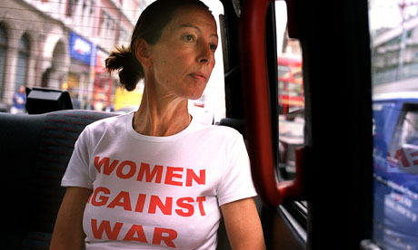
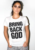
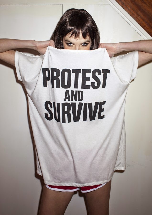


Katharine Hamnett CBE
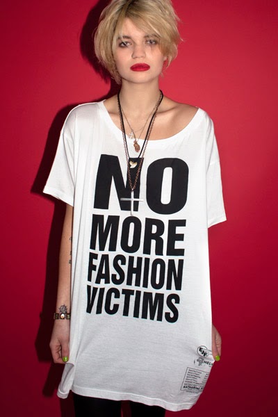
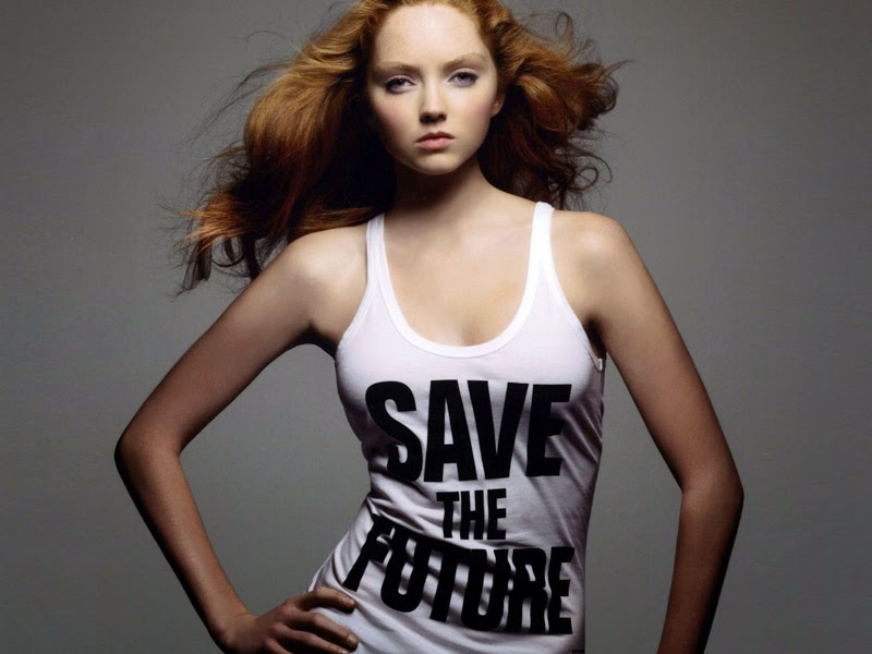
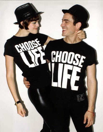
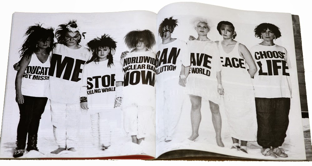
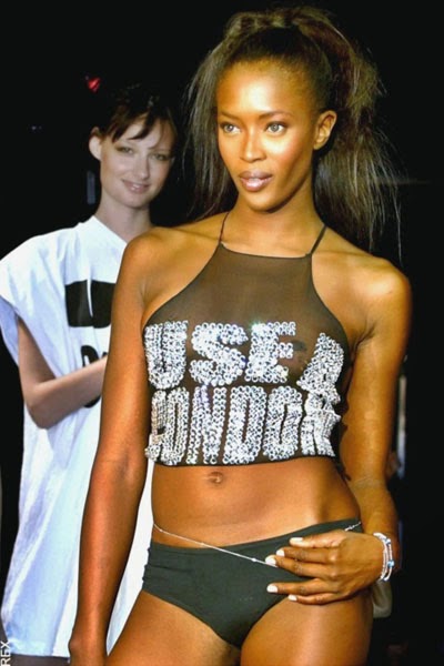
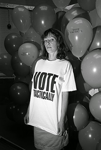 Katharine E. Hamnett CBE (born 16 August 1947, in Gravesend, Kent) is an English fashion designer best known for her political t-shirts and her ethical business philosophy. In the early to mid-1980s Hamnett's oversized t-shirts with large block letter slogans, launched in 1983, were adopted by pop bands including Wham!, with her "CHOOSE LIFE" slogan prominently displayed in the music video for "Wake Me Up Before You Go Go" and somewhat less prominently in Queen's video for "Hammer To Fall" (worn by Roger Taylor). Taylor also wore a "WORLDWIDE NUCLEAR BAN NOW" shirt during Queen's historical appearance at the first edition of Rock in Rio festival in Rio de Janeiro, Brazil.In 1984, ZTT's Paul Morley designed a series of "FRANKIE SAY..." T-shirts to promote the record label's chart act Frankie Goes to Hollywood (FGTH). Morley has stated that these designs were consciously based on Hamnett's slogan T-shirts: "What persuaded me was reading Katharine Hamnett saying she wanted the T-shirts ripped off, which reminded me of Mark P, saying he wanted Sniffin' Glue to be ripped off. And I mean, I did a fanzine, so when I read that I thought, great, fanzine T-shirts!" The official FGTH designs were particularly successful, and spawned many imitations of their own. More recently, models such as Naomi Campbell have appeared in Hamnett shirts bearing the slogans "USE A CONDOM" and "PEACE". Hamnett has since expressed scepticism that t-shirt slogans accomplish anything concrete, and suspects that for some, the slogans are a substitute for action. The "CHOOSE LIFE" slogan in the context of the day was directed at drug abuse and suicide. Because it is found in the Bible ("Now choose life, so that you and your children may live" – Deuteronomy 30:19) it has been used by the pro-life movement to encourage a choice against abortion, even appearing on license plates in 27 states.
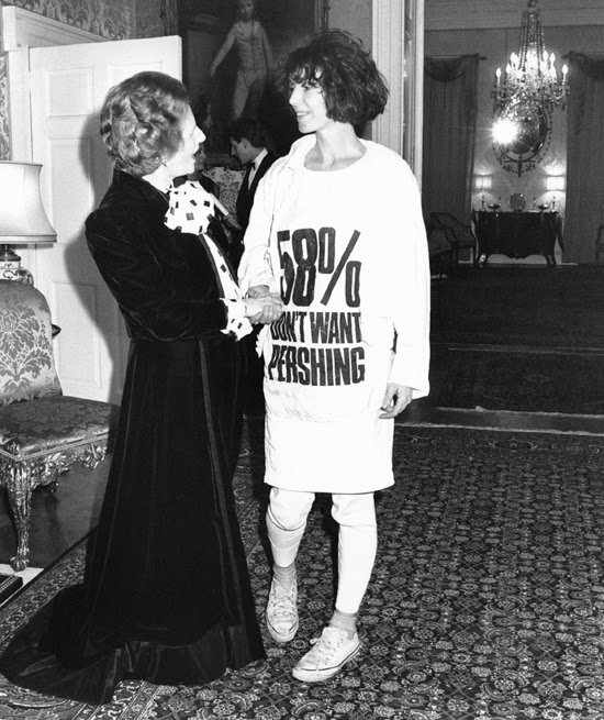 Beginning in 1989, with research showing pesticide poisoning in cotton-growing regions, and sweatshop labour a major part of the textiles industry, Hamnett began lobbying for major changes in the way the industry operated. After disappointment with the results, Hamnett terminated most of her licensing arrangements, and in 2005 relaunched her line under stricter ethical guidelines, including manufacturing and agricultural practices.At one point, Hamnett met with then-Prime Minister Margaret Thatcher wearing her own t-shirt with the slogan "58% DON'T WANT PERSHING", a reference to polls showing public opposition in the United Kingdom against the basing of Pershing missiles in the country. In 2003, at a London fashion show, Hamnett's catwalk models wore shirts with "STOP WAR, BLAIR OUT", a reference to the looming invasion of Iraq.In 2008, Hamnett said that fashion designers participating in the London Fashion Week were racist due to what she views as increasing exclusion of black models, stating: The catwalks are full of white dogs, cosmetic companies don't like black models – the racist bitches. I have no idea why when it's obvious that black girls are just so genuinely much more beautiful than Caucasians, who have clearly got the short straw. Black girls have much better body shapes and it's such a shame. I just think there should be a bit more of a balance. In 2013, Hamnett designed two different t-shirts for the Campaign for Nuclear Disarmament: "EDUCATION NOT TRIDENT" and "NHS NOT TRIDENT". As an additional sign of her commitment to the anti-nuclear cause, Hamnett joined the 55th edition of the Easter demonstration at Aldermaston, on 1 April 2013. On June 2014, Hamnett joined Nimrod Kamer to perform a stunt outside Hackney Town Hall, aiming to make Hackney Mayor Jules Pipe ban the weedkiller Monsanto Roundup being used in the borough. Hamnett won the first ever British Fashion Awards, and in 1996, was voted Britain's favourite designer by readers of Cosmopolitan. Hamnett was appointed Commander of the Order of the British Empire (CBE) in the 2011 New Year Honours, for services to the fashion industry.
Katherine Hamnett's Quotes
'You might think people would buy clothes out of pity, but they won’t. People buy clothes because they want to be excited about themselves. So it can’t just be goody-goody clothing; it has to be great clothing that just happens to be goody-goody, too. You’ve got to put the fashion first.'
'I think the challenge is, in fashion everybody wants to get rich and famous and it’s easy to get rich and famous by being a bad person. But the challenge is to achieve your goals—whatever they are—while staying a decent human being. That’s where it came from…I don’t want to make my living when the price is being paid in environmental degradation and human suffering.'
'The origins of clothing are not practical. They are mystical and erotic. The primitive man in the wolf-pelt was not keeping dry; he was saying: "Look what I killed. Aren't I the best?'
Katherine Hamnett Videos
Use of Colour
 Katherines Hammett's use of colour is very bold and eye-catching. She uses strong thick fonts (mostly always black) on a white canvas which creates a powerful look as the writing really stands out and the message is vividly show making her whole artwork look really influential. She uses a limited colour palette as most of her art pieces only use the colours black and white, however I personally like this as to many ranges of colour can make art look slightly messy and over powering. It also makes her work look more refined and slick; only using black and white creates a sharp and defined appearance. One of Katherines most famous pieces was her 'Choose life' t-shirt which was seen in the Wham 'Wake Me Up Before You Go Go' music video, these slogan printed t-shirts have gone world-wide with people regularly wearing them as a fashion statement through George Michael, fancy dress as the music video is so iconic or purely to spread the message of drug abuse and suicide. I believe that if these t-shirts weren't so simple but defined they wouldn't have been so popular which us why Katherines use of colour is so important. I think she probably chooses these colours as a fashion and political statement; these t-shirts aren't cute and girly, they don't use small feminine fonts with pretty colours. The main purpose of these t-shirts are to spread the messages across the top, which is why she uses such bold and sharp fonts and colours as she wants as many people seeing them as possible. Her style of only using black has become a worldwide trend as t-shirts with plain black font has become so popular with many people trying to recreate her famous style. I really think her use of colour has been successful as it makes her as an artist more unique as she doesn't feel the need to use a range of colours to make her work anymore interesting and exciting. It also defines her work as an artist as people will recognise thick black font against canvases as being the style of influence of Katherine Hammett's. Her use of colour is also successful as its spreading the message she's trying to show, its simple and basic which makes it the most effect as theres no other distractions taking away from the main focus. The colour also has developed into being extremely iconic and black contrasting white has started the trend of monochrome which is very popular in fashion today.
Use of Text
 The font which was frequently used in Katherine Hamnett's work is Helvetica Roman which is a similar font to Arial on Microsoft Word. It's a very thick and bold font which would be seen from a distance which was a technique purposely done so people can see the messages on the t-shirts clearly and properly. Nearly all the fonts used in Katherine's work are basic but bold so can be read clearly, its also not used as a distraction and doesn't incorporate images or fancy font to take away from the pure meanings of these often controversial or upsetting topics. The other font which she uses is Helvetica Inserat Roman which is just a more interesting font to her most used one which just adds a different element to her art pieces. The font which Katherine uses does reflect the theme well as its basic but straight to the point, she doesn't use a range of elaborate and lavish fonts as the message Katherine tries to share threw her art is purely the message printed on the tops. Katherine's whole art idea is about sharing and exposing messages which is similar to Arms around the Child as there constantly trying to gain awareness for there charity.
Use of Imagery
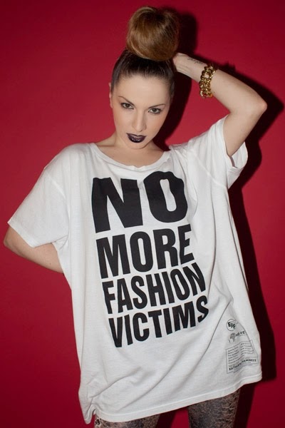 Katherine Hamnett doesn't use imagery in her work as she feels just the font is enough to create an overall good form of imagery. It slightly relates the theme as the font used in Arms around the Child is very important and is what people recognise the charity with, it also is a font which isn't to in your face as its easy to read which people need for when there glancing at it or have never seen it the charity before.
Hierarchy of Information (text and/or imagery)
What you read first when looking through Katherine Hamnett's work is the big font with the meaningful message across the top of the t-shirt. The writing is in thick black font and especially against the white t-shirt it creates a strong contrast and makes the message on the front stand out from a distance and more eye catching. My eyes are drawn to Katherine's work as its slightly 'in your face' and brash; the artwork isn't gentle or feminine its purposely trying to show a message so the way shes created her art is to grab peoples attention and be bold and powerful. The order of the way you look at Katherine Hammett's artwork is from the top to the bottom, meaning that you'll read the message on the t-shirt from the top and then to the bottom, a technique which she used was the start of the message was in a big thick font and as the sentence continued the font got less bold and big. Also sometimes the words which are most important in the message she would make it stand out the most so thats what people firstly see and remember. In my opinion the hierarchy is in the correct order as the most important words often stand out and the way Katherines laid out her artwork is professional and easy to understand.
Tools and Techniques used
I think the tools and techniques which were used throughout Katherine Hamnett's art work are computer illustration and word printing as all of her art work is printed onto clothing items like tops, hoodies, shirts ect. I think she used a computer illustrating software to actually create the writing which was printed onto the clothing, as after research I found out the most popular font which she uses on her art work is Helvetica Inserat Roman.
Website
This is the link to Katherine Hamnett's offical website where she actually sells her artwork clothing to the general public.
http://www.katharinehamnett.com/
Animation Creating
Draft Ideas
These photos are of the draft ideas for my final piece for Arms Around the Child. I tried to create three individuals ideas, using three unique quotes which I found through my research of the popular charity.
Design One
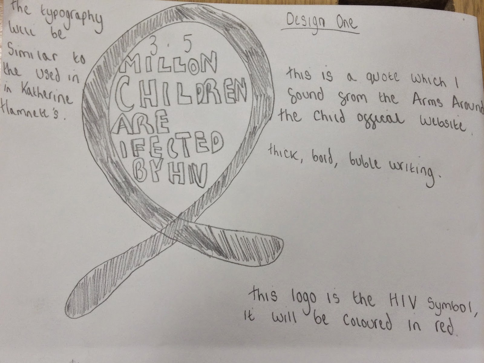.jpeg) This was my first draft design, I researched a fact about children with HIV and stumbled across this fact on the Arms Around the Child website, the complete fact says '3.5m children are infected with the HIV virus' a very heartbreaking and harrowing statistic which would really touch the public. I decided to create the HIV symbol which looks similar to the Breast Cancer charity logo as their both ribbons. However I will colour the HIV ribbon red (which it already is in the well known symbol). In the middle of the ribbon I added the quote (a shortened down version to the original). Also if I decide to develop this idea further I will somewhere on the design add the logo for Arms Around the Child so people recognise and refer this design to the charity. The typography will be similar to the font used in Katherine Hamnett's artwork which is Helvetica Inserat Roman, I also want it to look like bubble writing so its unique and eye catching.
This was my first draft design, I researched a fact about children with HIV and stumbled across this fact on the Arms Around the Child website, the complete fact says '3.5m children are infected with the HIV virus' a very heartbreaking and harrowing statistic which would really touch the public. I decided to create the HIV symbol which looks similar to the Breast Cancer charity logo as their both ribbons. However I will colour the HIV ribbon red (which it already is in the well known symbol). In the middle of the ribbon I added the quote (a shortened down version to the original). Also if I decide to develop this idea further I will somewhere on the design add the logo for Arms Around the Child so people recognise and refer this design to the charity. The typography will be similar to the font used in Katherine Hamnett's artwork which is Helvetica Inserat Roman, I also want it to look like bubble writing so its unique and eye catching.Design Two
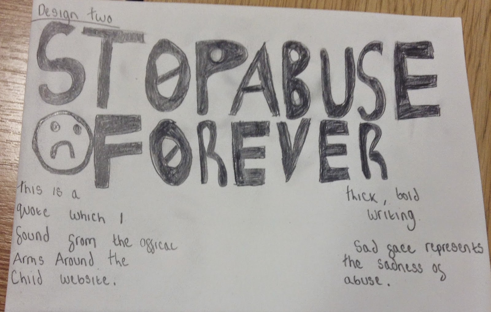
This is my second draft design which is slightly less imagery technical. I found another fact from Arms Around the Child which I thought was interesting but also upsetting and that would connect with the general public. The complete fact says '40m children are subjected to abuse every year' which although was very hard hitting I thought wasn't so rememberable and catchy so I changed it to 'stop abuse forever' which was more punchy and straight to the point. I decided this design was going to incorporate more of Katherine Hamnett's art work, so I only used one type of imagery and focused more on the typography. The fact was drawn in thick black, bold writing would could be seen from a distance, I added the stop symbol to the o's which made it more detailed. Lastly I added a sad face symbol next to the 'forever' for a last finishing touch and to relate to how heartbreaking this fact is and the benefit Arms Around the Child does. If I decide to develop this idea further I will make it look more slick and professional, I also made incorporate more imagery as this design is mostly typography based.
Design Three
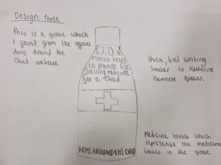.jpeg) This is my third and final draft design which incorporates typography and imagery. I again got this fact from the Arms Around the Child official website. The fact from the website says '£20 or $30 per month helps to provide life saving medicines and treatment for a child', I changed the fact so it would be more catchy and easier to remember to '£20 a month helps to provide life saving medicine for a child', the fact wasn't changed much but was less wordy. I added the fact onto a medicine bottle which made it look neat and related to the fact, I tried to draw the medicine bottle as accurate as one which would be used to medicate people affected by Arms Around the Child. Finally I drew the logo of the charity onto the bottom of the medicine bottle so people who saw my design could tell it relates to the charity. If I was going to develop my third design further I would make the bottle look as realistic as possible and finally add specific details like the type of medicine bottle used and symbols which relate to the charity.
This is my third and final draft design which incorporates typography and imagery. I again got this fact from the Arms Around the Child official website. The fact from the website says '£20 or $30 per month helps to provide life saving medicines and treatment for a child', I changed the fact so it would be more catchy and easier to remember to '£20 a month helps to provide life saving medicine for a child', the fact wasn't changed much but was less wordy. I added the fact onto a medicine bottle which made it look neat and related to the fact, I tried to draw the medicine bottle as accurate as one which would be used to medicate people affected by Arms Around the Child. Finally I drew the logo of the charity onto the bottom of the medicine bottle so people who saw my design could tell it relates to the charity. If I was going to develop my third design further I would make the bottle look as realistic as possible and finally add specific details like the type of medicine bottle used and symbols which relate to the charity. Final Design Drawing
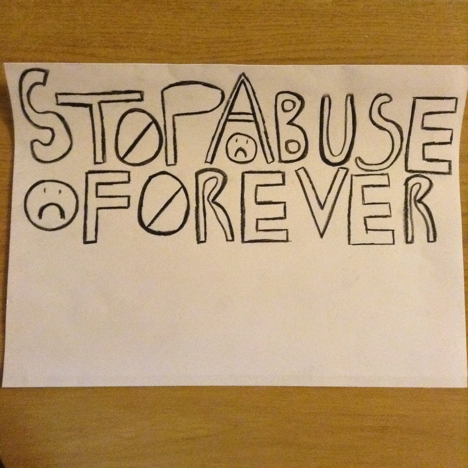.jpeg) This is my draft drawing of my final design. I decided to choose the second design as I felt it was my most slick and professional design. It also was the design which most related Katherine Hamnett's work as she uses a lot of bold typography. I developed this idea further though changing the style of font, in the original design it more bubble writing and slightly childish looking. I developed it to make the font more bold and stand out so I changed the style of font to more thick and defined shapes. I also added a few more forms of imagery in the shape of sad faces which I felt made it more relatable to the charity as its aimed at helped children. I added these sad faces around the typography so it would look more interesting.
This is my draft drawing of my final design. I decided to choose the second design as I felt it was my most slick and professional design. It also was the design which most related Katherine Hamnett's work as she uses a lot of bold typography. I developed this idea further though changing the style of font, in the original design it more bubble writing and slightly childish looking. I developed it to make the font more bold and stand out so I changed the style of font to more thick and defined shapes. I also added a few more forms of imagery in the shape of sad faces which I felt made it more relatable to the charity as its aimed at helped children. I added these sad faces around the typography so it would look more interesting.Ethical Designer Digital Outcome
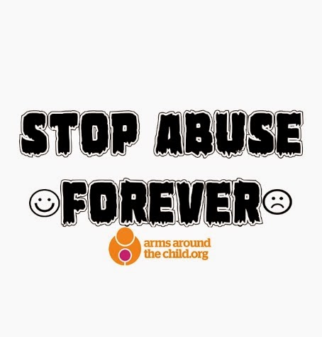
This is my digital outcome of my final design drawing. I created it on Adobe Photoshop and used other software including font creating website 'Dafont'. I started the digital design by searching through multiple pages of 'Dafont' after looking for a while and downloading and experimenting with different fonts I found this one which I thought was the most interesting and unique. Under Dafont its called 'marsh thing' which is cool and horror looking font which relates to abuse being dark and harrowing. After I downloaded this font I experimented with changing the sizing, colour and layout of the phrase before finally deciding on this style. I like that the font has a contrast of black and white with a thick bold outline of white contrasting against the block colour of black. I added the arms around the child logo to the bottom of the phrase so people are aware that it refers to the charity. For final touches I incorporated two symbols; the sad and happy face as I wanted it to have a young feel and relate to it affecting young children, it also makes it slightly more modern and interesting.
Ethical Designer Storyboard
This is my storyboard design for my animation about charity Arms Around the Child and the chosen fact I decided to use. The fact I decided to use was '40 million children are subjected to abuse every year' as I felt it was a very hard hitting and harrowing static which will persuade a lot of people to donate to the charity. I created the animation through 5 different parts which I will turn into layers on Photoshop. I want to incorporate more images then I did in the first animation I created 'fact animations'. I decided to spread the fact out onto each section so it wasn't all on the first section. Each section I drew images which relate to the words or sentence in the section like the '40 million' in the first part I will use loads of images of people around the two words so it makes it look interesting and also a background.
Creating The Animation
Final Animation Gif
Ethical Designer EvaluationI got a lot of influences from a variety of artists and designers through the process of my animation creating but specifically fashion designer Katharine Hamnett CBE as I found her work very interesting and unique. I really like her use of bold fonts to spread messages as I feel they are a great way to engage a wide audience as in a way it really stands out and 'in your face'. Katherine doesn't try and create her work to look overly pretty or fancy as her style is bold, thick typography which is created to make a stand out impact. I wanted to use this type of style within my own work as I really liked researching and looking into Katherine Hamnett's. I used this style of typography in my digital outcome where I used a a really bold font which I found from Dafont and also incorporated Katherine quirky style by adding the sad and happy face either side of the typography which I felt added a slightly quirky feel to the piece of graphics as I wanted to use another influence I gained. My influences also continued with my animation as I decided again to use bold and engaging fonts which Katherine uses as I felt I wanted my animation to look interesting with the use of mixed fonts. Some areas I would improve on if I was going to create this animation again would maybe to develop my use of graphical skills more, meaning I would use more graphics rather then images to make it more of the style of an animation. Although I was pleased with my animation I feel now I have gained skills to expand my animation by using more graphics, I would scan drawings I created rather then finding them from the internet and also maybe develop the overall animation further by using a variety of graphical skills which I have learnt from this unit. I feel my overall outcome is successful as I have clearly used influences from my artist. I also feel I have improved my skills from the first animation I created (earlier in the unit) which lead to me creating a more developed animation. When I created my first animation (about a unique fact) I was slightly in the dark as I hadn't really created an actual detailed animation before, but during that process I feel I gained experience and knowledge for the Arms Around The Children animation. I feel my animation does reflect the ethical theme as I researched the charity a lot which gained my knowledge on the ethical theme of this project. I feel my animation reflects the ethical theme as I used a variety of images which reflect my quotation; my quote was about children being subjected to abuse so I decided to use images which reflect and symbolise that. For projects in the future I will approach it slightly differently as I will use more of the skills I have developed from this unit. For the next task I get set I will try to make my graphical skills more advanced and use a range of skills to show my ability and knowledge I have gained. Overall I'm pleased with how my animation has turned out as I feel it portrays a variety of new skills I have learnt this year, I enjoyed this assignment and found animation creating interesting and fun.





.jpeg)
